 |
| Various weirdos and undesirables gather for a blurry photo in front of Muller's Tower |
But that wasn't going to stop me, and in the spirit of Rogue Trader, Blue Peter and the tutorial videos that I always end up watching on YouTube, I decided that the recycling bin was the best place to start my quest for terrain.
I'd already thrown together some small pieces of scatter terrain, but I wanted something with some height and visual impact for my first project, and right there in the familiar pictures from the original RT rule book was the perfect source of inspiration.
 |
| Rogue Trader armies clash on Beige World |
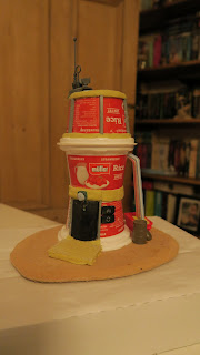
It meant that I had to buy a couple of pots of rice pudding, but then I like the stuff, so waiting for them to be empty was more of a chore than actually eating them.
 |
| Muller's Tower - still showing too much product placement. |
 |
| Rear view - we keep piles of it round the back... |
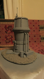
I added an aerial and radar dish from an IG tank accessory sprue for some detail (there's also a hatch on the roof that's not visible in these shots) and then a bag and oil drum from a Tamiya sprue to suggest the rubbish that the resident has thrown out.
 |
| Does the Space Core Directive specify Ocean Grey or Battleship Grey? |
 |
| Nothing to see here. |
 |
| Ground looks like porridge. |
 |
| When's bin day? |
The ground texture was created using Luke Fellows's basic recipe for texture paint, basically DIY filler, sand and paint the colour of your choice.
I wanted a more rugged, ash waste look, and so I used a mixture of Budgie Sand and Budgie Grit (yes, there is a difference) from Wilkinsons, a charcoal house paint sample from the same store and some pound shop filler, the bill for all of which was less than five pounds.
I think that I used too much grit on this occasion, and the filler lightened the paint too much, meaning that it needed to be repainted with the original colour, but once it was drybrushed with some lighter shades of grey house paint, it look pretty nice.
 |
| Muller's Tower - Far Corfe des res? |
 |
| Front elevation. |
 |
| Bill Posters will be prosecuted - once we find the bugger. |
 |
| Septic tank playing up? Sling deead Grox in it... |
Heavy sponge weathering with a mixture of black and Burnt Umber craft paints (one pound each from The Works) and then chipping with Boltgun Metal (now Leadbelcher) made it all look nice and neglected, with Mechrite Red and Iyanden Darksun for the drum and macerator respectively for a little counterpoint to the main building.
I then watered down the black/brown mix used for the original weathering to make a wash that I applied to the entire building VERY liberally, to tie it all together and fill the nooks and crannies with the essential grime needed in Far Corfe.
The last detail was to add a couple of posters downloaded from one of the Necromunda Facebook groups and stick them to back of the tower after being torn and distressed a little, the sticking being achieved with a watered down mixture of PVA glue and Gryphonne Sepia wash.
The posters were almost an afterthought, but I think they're actually one of my favourite little touches on the piece, adding a small amount of realism and making the rear of the tower appealing to look at as a backdrop almost as much as the front.
The only problem that I can envision is in explaining to my three-year-old daughter what happened to the flowerbeds she insisted that the garden needed...
I have other terrain projects on the way and some of them are going to be mini-tutorials as well, so as always, let me know what you think in the comments below and I'd really love to hear your thoughts on this build.


No comments:
Post a Comment